
Apptisan #047 - Corner Time
For this edition, we welcome Yiyang, an digital product designer and the creator behind Antidull. Frustrated by the tiny but persistent inconvenience of having to hover his mouse to check the time...


Name: Corner Time
Developer / Team: Antidull
Platforms: macOS
Read this newsletter issue in Chinese (中文) .
Please describe your product.
Corner Time is a Mac app designed for users who want to keep the time visible even when the menu bar is hidden, allowing for a quick glance whenever needed. At its core, it’s a simple time display utility, enhanced with customization options for format and style, multi-language support, and compatibility with multiple monitors.
To be specific, when you enable the “Automatically hide and show the menu bar” setting on a Mac, all information in the menu bar, including the clock, disappears. You have to move your mouse to the top of the screen to reveal it. With Corner Time, the time remains persistently visible in the corner, so a quick glance is all it takes to check it.

Was there a ‘aha!’ moment that inspired your product’s creation?
On my MacBook, I’m a big fan of auto-hiding both the menu bar and the Dock. This maximizes screen real estate for the application I’m using and minimizes visual distractions. Most of the time, I don’t need the application menus in the top-left or the various icons in the top-right, nor do I need the Dock for switching apps.
While this setup works perfectly for my “distraction-free” workflow most of the time, it becomes inconvenient when you need to frequently access information from the menu bar. For me, the most common action was checking the time. Although it seems like a minor inconvenience to just hover the mouse, it adds up over time and disrupts the experience. Not to mention, there’s a slight animation delay when the menu bar appears (the Dock’s animation can be disabled), and on an external monitor, it can be tricky to position the mouse precisely in the trigger area. These small details made the experience feel imperfect. An ideal setup shouldn’t require such a sacrifice.
For a long time, I just put up with it, accepting the flaw as a given. Then one day, while playing a game, I was struck by a particular interaction design that I thought could solve my problem. That’s when I started coding.
However, after building and testing the first MVP, I found myself constantly forgetting to use the new interaction I had designed. It’s like giving a watch to someone who is used to checking the time on their phone; it takes a while to build the new habit of looking at your wrist. That MVP eventually evolved into another app (stay tuned for that). But it was during its development that I learned about the window layering APIs. I discovered that a window could actually be placed in the same layer as the menu bar. After some experimentation, Corner Time was born as a much simpler and more intuitive solution.
Beyond specific ‘aha!’ moment, how do you generally find and nurture creative inspiration in your daily life?
I spend most of my days in front of the computer, so my routine is fairly consistent.
I browse Twitter to see what interesting projects other creators are working on and use Eagle to save and tag designs that catch my eye.
Usually, when I’m feeling close to burnout, I’ll pick up a new game, watch a new movie, or try some other form of entertainment to clear my head and get a change of pace.
Could you walk us through your typical workflow, from initial concept to a shipped product? What key tools or methodologies do you rely on?
My philosophy is to build first, then refine.
For a product like Corner Time, once I have a solution in mind, my process is usually:
Prototype: I start by coding a rough version to validate the core functionality. I jot down initial to-do items in Apple Notes.
Dogfooding & Iteration: I use the app myself for a period, constantly refining details and improving the experience based on my own use.
Marketing: Finally, I create the promotional materials, such as screenshots and videos, for the launch.
What makes your product unique compared to others in the market?
I believe its uniqueness lies in its highly focused use case and its novel, effective, and intuitive solution.
Other products that might address this need are often comprehensive desktop widget suites that allow for extensive customization. Corner Time, however, is laser-focused on one thing: solving the problem of time visibility when the menu bar is hidden. While the widget suites may have a broader audience, I wanted Corner Time to be a lightweight tool that perfectly solves this specific, long-standing annoyance for people like me.
The philosophy behind Corner Time is a commitment to simplicity and perfection. Users who hide their menu bar typically value minimalism, focus, and a clean visual aesthetic. Corner Time is designed to reflect that.
From the moment a user first opens the app, it delivers a near-native experience with almost no configuration required. The default style and position are designed to be virtually identical to the system clock, and it integrates perfectly on MacBooks with a notch, never obstructing any application content.
How have you marketed your product, and what key lessons have you learned?
I actually had trouble finding people in my immediate circle who share my habit of hiding the menu bar. So, I posted about Corner Time on Reddit, sharing the app and asking for feedback. I was fortunate to get a lot of comments from users sharing their thoughts and reporting issues.
I find Reddit to be a relatively fair and transparent platform. As long as you find the right subreddit and follow its rules, you can get decent exposure and engagement, even as a first-time poster, provided your content sparks discussion or offers value.
I received a lot of unexpected suggestions and feedback from Reddit. Some people even DMed me asking if they could feature the app on their independent websites.
However, even when sharing it in Mac-related communities, many people commented that they never even knew the menu bar could be hidden. Looking ahead, I plan to expand my promotional channels to platforms like Twitter and LinkedIn. I’m also considering a different narrative approach—perhaps by sharing the pros and cons of my Mac setup and the benefits of hiding the menu bar. The goal would be to encourage more people to adopt this workflow, which in turn might lead them to try Corner Time.
What has been some memorable feedback since your product’s release?
A few comments really made an impression:
Some users said they didn’t even realize they needed the app until they saw it.
Others mentioned it would become one of the very few apps they would genuinely run 24/7.
One person, who had never tried hiding their menu bar before, said the app and its solution convinced them to change their habits.
These comments were incredibly validating. They made me feel like I had found my tribe, which is a really rewarding feeling.
How do you typically structure your day to stay productive and creative? Any favorite time management techniques?
Right now, I don’t have a strict routine, and my time management isn’t the best. I often find myself pulling late nights to get things done.
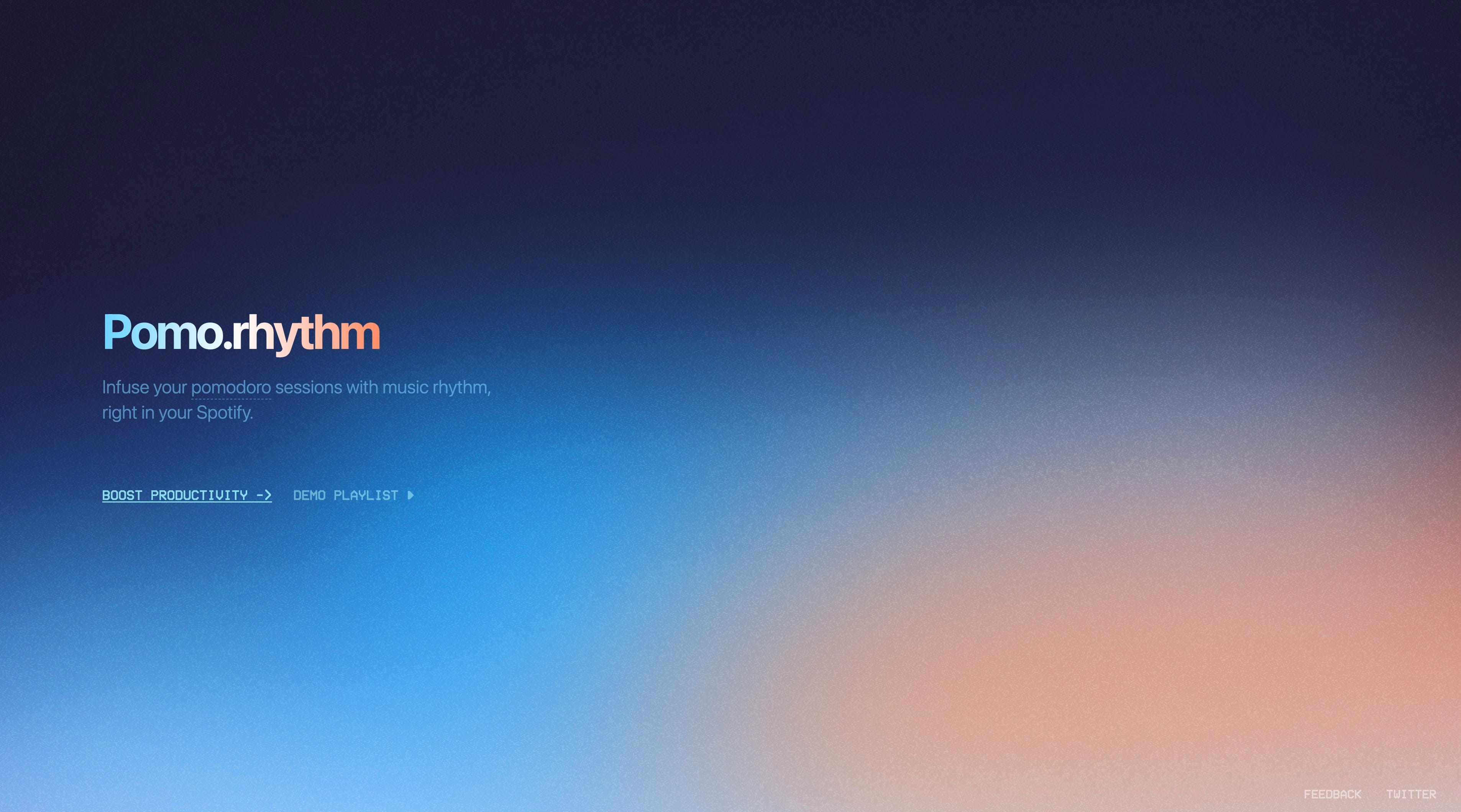
I once built a product called Pomo.rhythm that generates playlists timed to the Pomodoro Technique—for example, playing Lo-fi music during focus sessions and switching to EDM or rock during breaks. The idea was to create a more natural way to be reminded to rest. I use it from time to time, but most days, I just ride a wave of focus until it naturally subsides.
Are there any products out there that you feel deserve more recognition?
TopNotch: A utility that visually ”hides” the black notch on newer MacBook models, reducing a nagging visual distraction.
Hyperduck: When you’re on the go and find a website or long article on your phone that you want to read later on your computer, you can easily forget. With Hyperduck, you can send the link to your Mac from the share sheet, and it will automatically open in your default browser when you get back to your computer.
A Wrist Rest: This is my “lifesaver” for my wrists. It significantly reduces discomfort, and I never use my computer without it.
The tools you mentioned, TopNotch and Hyperduck, also focus on solving specific pain points with an eye for detail, much like Corner Time. From a product design perspective, what common traits do you see in these types of products? Does this reflect your own criteria for choosing tools?
I listed those products mainly because they are tools I use at a high frequency every single day; they have truly become part of my routine. While I admire many beautifully designed and feature-rich apps (and I collect some of them), my current life is a bit chaotic, making it hard to form new habits.
Therefore, the products that stick with me tend to share this trait: they don’t require me to change my existing habits. Instead, they integrate seamlessly into my workflow, feeling so natural that they are almost unnoticeable. You only realize their value when they’re gone. They might not have the most polished UIs or interactions, but they are exceptionally solid, stable, and well-crafted in every detail.
Would you mind sharing your phone and computer home screens with us and a few of your go-to daily apps?
I generally open apps by searching for them, so I keep my home screens very clean. The apps I use most frequently are in the Dock, and I use the Today View (the widget screen) for things like weather and time zones. This approach keeps my main screen tidy and prevents me from subconsciously opening an app just because I see its icon, which helps me stay focused.

On my iOS home screen, I’ve also placed some custom icon placeholders I designed purely for aesthetic balance.
On my Mac, I keep the menu bar and Dock hidden and have TopNotch enabled for a minimalist setup.

Which creators do you look up to, and what admirable qualities do you see in them or their work?
Oki Sato, the founder of the design studio nendo. He once said that he doesn’t actively seek out inspiration but rather enjoys the mundanity of everyday life. Yet, he masterfully captures inspiration from the smallest details of daily life, creating designs that are simple, ingenious, and bring moments of “aha!”. He taught me the importance of staying curious and sensitive to life, which is key to discovering new possibilities. Looking back, the name Antidull was subconsciously influenced by him.
Chacha Chang, a music producer and musician. Although I’ve never seen him perform live, you can feel his passion for music even through a screen. Only someone who is truly in love with their craft and completely dedicated can exude that kind of raw energy during a performance. That infectious sincerity, combined with exceptional skill, is a quality I deeply admire in a creator.
Tell us a bit about yourself and what you envision for the future.
I’m Yiyang. My background is in industrial design, and I currently work at a startup leading product design and doing some front-end development as the sole designer. Maimo is the first product we launched.
Corner Time is my first personal app on the App Store, released under the name Antidull. In the future, I hope to get Corner Time in front of more users while continuing to create other useful and interesting products. I also hope to connect with more creators, just as this project led me to meet Shigeru from Apptisan.
I’m curious, how does your background in industrial design influence your digital product design? Does it give you any unique insights?
At its core, all design is about redefining and optimizing the relationship between people and their environment—be it physical or digital. However, the different constraints of each environment certainly shape one's way of thinking.
In the physical world, every design choice has tangible consequences: weight, space, cost, lifespan, and so on. Many problems, once they arise, are incredibly difficult to fix. This demands a higher level of foresight and attention to detail from the outset. My industrial design background has probably made me more inclined toward a “less is more” philosophy, training me to be disciplined in feature selection and to avoid endless complexity.
Furthermore, industrial design often emphasizes anticipating and mitigating potential problems in the early stages rather than relying on later fixes. Once a physical product is mass-produced, the cost of fixing a mistake (recalls, repairs, reputational damage) is enormous.
I believe this mindset is still incredibly valuable in the fast-paced world of digital products. It encourages a deeper focus on the holistic user experience, the integrity of details, and the consideration of long-term impacts and edge cases. While it's hard to articulate the full impact of my background in a few sentences, its DNA is subconsciously embedded in my design decisions. As the saying goes: I can’t remember all the books I’ve read, just as I can’t remember all the meals I’ve eaten, but they have all made me who I am today.
About Apptisan
Apptisan is a portmanteau of “application” and “artisan”, signifying “a weekly exploration into the world of apps and the passionate artisans who create them.” Each issue is a conversation with global creators, aiming to uncover and present intriguing products to a wider audience.
For those who prefer Chinese, you can subscribe via Quaily. Creators interested in featuring their products are encouraged to submit them through our form, and we’ll be in touch promptly.
Supporter Status
Apptisan currently operates without any paid subscriptions plans. If you enjoy our content and would like to support our independent work in discovering and sharing more great app stories, here are a couple of ways you can help: